SUADC/ART and Solar8000/DAP #701
Dear vitalDB team,
I am currently working on arterial pressure waveform, and trying to recompute diastolic, systolic and mean value from the waveform. I noticed a bias in some patient (not all).
For instance, looking at case_id 1768 and plotting the waveform against DAP an SAP value given in the dataset, one can observe that it does not match the max and min values:
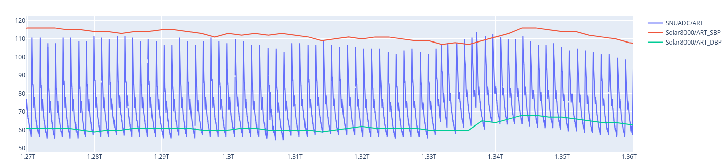
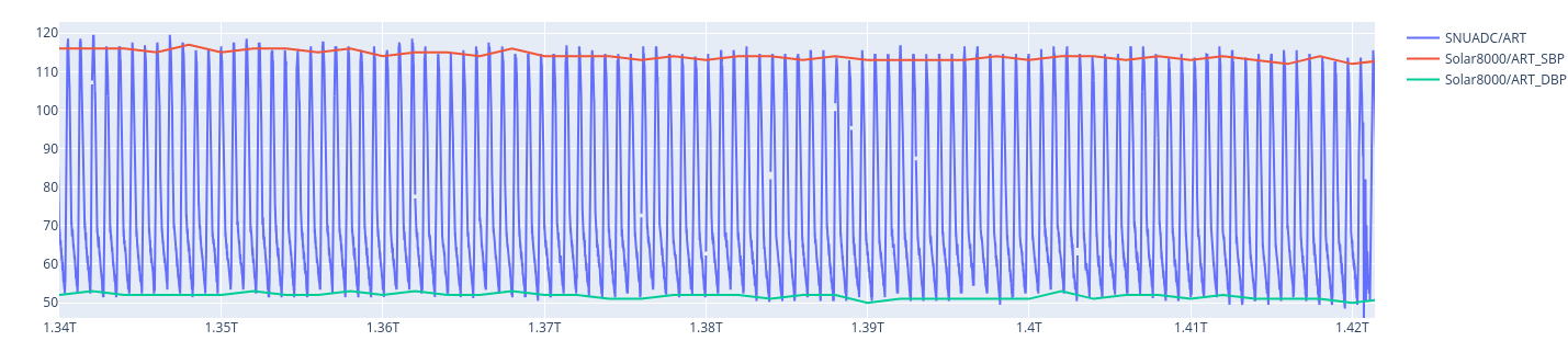
While for case_id 1, there is less bias for instance.
I notice that a different might came from a low-pass filter, but I do not understand why there is a bias for some patient. Do you have any insights on the inner working of the Solar8000 algorithm ?
Thanks for your help,
Best regards,
Bob
Update: Investing a bit in the topic, I found that the case id 321 is the one with the most deviation from the waveform and the computed value given by solar8000. I did not manage to include a new picture in the comment but you can quickly visualize the issue with the code
import vitaldb as vdb
import numpy as np
import matplotlib.pyplot as plt
caseid = 321
track_names = ['Solar8000/ART_SBP', 'Solar8000/ART_DBP']
vf_waveform = vdb.VitalFile(caseid, ['SNUADC/ART'])
vf_num = vdb.VitalFile(caseid, track_names)
wav = vf_waveform.to_numpy(['SNUADC/ART'], 1/100)
num = vf_num.to_numpy(track_names, 2)
Time_wav = np.arange(0, len(wav)/100, 1/100)
Time_num = np.arange(0, len(num)*2, 2)
plt.figure(figsize=(20, 5))
plt.plot(Time_wav, wav[:,0], label='Waveform')
plt.plot(Time_num, num[:,0], label=track_names[0])
plt.plot(Time_num, num[:,1], label=track_names[1])
plt.legend()
plt.show()